Thursday, March 29, 2012

Evaluation.


The lectures I have been attending, (especially the Art and Revolution lecture) have often introduced me to artists I have never come across before and which important points in history have influenced certain art movements. The lectures have definitely expanded my knowledge of art history, key art movements and the artists involved.
In my previous further education a formal approach to teaching students the history and context of art was often neglected. This has resulted in the fact that I relished the chance to actually be taught about the subject I am passionate about and to hear the views and thoughts of others also passionate.
Making notes through out the lectures was never a problem for me, and having my own copy and interpretation to look back on definitely helped cement my understanding. Re-writing the notes onto my blog was what I sometimes found difficult. Previous to being a student of Vis Com, I have never had my own blog and it did take me a while to get used to using one. At first I was very reluctant to use it and believed that I would really never grow to love blogging, but after the first term I realised how wrong I had been to think this!
After realising blogging was no where near as bad as first thought, the hard part of COP came in the form of having to re-type all of my notes. I have to admit I never really enjoyed doing this and sometimes I would forget and would be adding notes from a lecture a week or so after its viewing. However, I quickly realised that re-typing my notes really helped me when it came to remembering what the lecturer had said and I have certainly remembered and understood a lot more through this re-writing.

Writing an essay, although never fun was not something I had a huge problem with as I have always studied English and have had a lot of practise writing essays. The fact that I also studied Media for A-level meant I had some knowledge of advertising to draw upon when I started to struggle.
When writing my essay, I realised how the COP lectures and seminars have helped me to produce well-informed arguments and criticism and so has improved my ability to analyse theorists’ opinions within my academic writing.

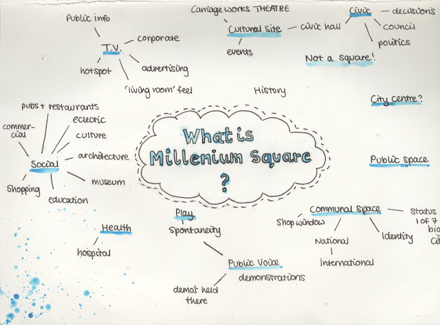
Relating Millennium Square to my essay was a difficult but enjoyable task. The opportunity to talk to the others in my group who had chosen the same essay title was great, and we managed to come up with great ideas as a team.
Lucy and I decided that we would like to collaborate, as we felt the ideas we wanted to equate onto Millennium Square were very similar. This made the project more enjoyable as working with Lucy was great and I really like the work that we have produced. I am glad we took David’s advice and re-designed the second page, but it was a little last minute and I wish we came up with the idea earlier so we could have had longer to improve it. It is not quite up to the standard I would have liked.

Overall I feel that due to the Context of Practise module I have really expanded my knowledge concerning the historical and contextual background of visual communication, and art in a broader sense too.  Next year, I want to carry on being inspired by the lectures and work on my academic writing skills and hope that both get better simultaneously and improve one another.
Wednesday, March 28, 2012

Millennium Square

We were told by David that the page containing our written proposal looked odd as it was hand drawn and next to such a computerised page (the one containing the signs we had created). We agreed with him and changed it so it was written in the same style as the Byelaws plaque in Millennium Square.
The Final 2 page spread:


The Group Pages to go at the beginning of our advertising section:


Tuesday, March 27, 2012

Lecture Thirteen: High Art/ Low Art


Distinguishing between good and bad and making critical evaluations are a part of everyday life. We do it consciously and sub-consciously and not just with art. This lecture obviously focuses upon how and why we do it when it comes to art...

Good taste/bad taste
Aesthetics
Judgements/criticism
Value
Art!

*Jack Vettriano
-His prints are huge sellers.
-Refused to be accepted as an 'artist' by the Tate Britain. They refused to allow him to exhibit his work there- too commercial.
The Singing Butler.

*Aesthetics
What is beautiful? Beauty is an idea.
-18th century philosophers of aesthetics realised that beauty was almost an 'idea' that you brought to something. Not just the idea that an object is beautiful, e.g. a rose is beautiful, nature at it's best and everyone will see that, but instead grew to understand 'beauty is in the eye of the beholder'. It is a personal opinion and is subjective.
-David Hume recognised we needed something to value the judgment of beauty against. A certain kind of person who is 'aesthetically tuned', or a conecuir become the people who set the criteria of taste. Typical of the time period those 'aesthetically tuned' came from the privileged class of people, so the upper classes deemed what was actually beautiful.
-Obviously richer people had the time to think about beauty.
-This helped create further devisions between the class. 

*What is an aesthetic experience?
-Monroe Beardsley
-Acute attentiveness
(DISINTERESTEDNESS)- not brining any agenda, just focusing upon the beauty.
-intensity.

*Clive Bell
Significant Form
'The relations and combinations of lines and colours, which when organised give them power to move someone aesthetically.'
-Disliked artists who painted to show political scenes, give messages or show a narrative. He believed these were just social documents that did not capture beauty. E.g:
william powell frith derby day 1856-8

-He loved Cezanne.
cezanne mont sainte-victoire, 1900

He believed that if you were not moved by this painting than you weren't 'clever enough'. It hs been deemed beautiful by the elite, therefore if you don't feel moved you are not educated enough, you don't understand beauty.

*Art for Art's Sake
James Abbot McNeill Whistler
Nocturne in Black and Gold (1874-78)
-No subject, no message, just an attempt to create something beautiful, something aesthetic.

*The arts for arts sake dominated much thinking and practise in 20th century art.
*Clement Greenburg
-Figurehead behind the scenes of abstract expressionism. Said all art was leading up to Pollock, who he believed created art that was just an aesthetic experience. Just paint, no hidden message.
-He hated kitsch.
Pollock, Lavender Mist (1950)

*Dorothea Lange
Migrant Mother (1936)
-This was commissioned by the American government as part of a campaign to raise awareness and money. However, it is still viewed in galleries and given properties and views Lange might not have intended to have. Has reached a sort of high art status.

*What is Kitsch?
-For Greeenburg kitsch could be characterised as the various forms of popular culture.
-The more accurate definition is objects that aim and aspire to High Art or importance, but somehow fail and appear to popular culture instead.
-E.g. Constable Painting
-When hung in a gallery, it is definitely not kitsch, appears as classic painting. However, placed in a mock gold frame and hung in a run-down living room it becomes it! Aspiring for better things but falling short.
Monet on a mousemat= Very kitsch!
-Anything jumping across media. Painting or etchings turned into usable objects.

-Repainted masterpieces for the modern eye, simplification of style.
-There is something eternal and universal in beauty. If you choose to chase vogue style, and follow fashions, it quickly looks dated and becomes kitsch.
-As does anything over emotional, or cheesy
:D
-Animal themes. Truly kitsch as in many cases it aims to be taken seriously as fine art. 

Jeff Koons, Michael Jackson and Bubbles the Monkey (1988)
-Making a gesture to challenge the arbiters of taste, is this not art now it is in a gallery?!

Toulouse-Lautrec, Moulin Rouge: La Goulue, 1891

-Even though he was working to a brief, and most of his work was commercial, it is still considered art. So there are exceptions.

*Thomas Kinkade, Painter of Light. My new hero...


-He claims to be "America's most-collected living artist". Media Arts Group-- the former publicly traded company that licensed, distributed and sold Kinkade's products-- claimed that 1 in 20 homes in the U.S. feature some form of Thomas Kinkade's art.
Kinkade has received criticism for the extent to which he has commercialised his art—for example, selling his prints on the QVC home shopping network. Others have written that his paintings are merely kitsch, without substance, and have described them as chocolate box art and "mall art."
*Modes of Criticism.
-Subjectivism

-Relativism (criterion based)

*George Dickie, An Introduction to Aesthetics, 1971

*The criteria needed to evaluate objects really changes, evaluating good and bad holds a number of problems.
-Reativism is the best way to make judgments. R.M. Hare's argues that moral propositions remain subject to human logical rules, notwithstanding the absence of any factual content, including those subject to cultural or religious standards or norms.

Essay- Final, revised draft.


‘Advertising doesn’t sell things; all advertising does is change the way people think or feel’. (Jeremy Bullmore) Evaluate this statement with reference to critical theories (past and present).

      In today’s society we are bombarded with advertisements- when we watch the television, read a magazine, log on to the Internet, see billboards… the list goes on and on. It is a huge part of modern culture and companies or corporations spend a great deal of money producing them; some seemingly spending more on advertising than on actually researching their product. Rather shockingly ‘A York university study revealed that pharmaceutical companies spend twice as much on advertising as they do on research.’ (Random History, 2011)
Being a hugely expanded market and with more money spent on it’s development, advertising has had to become more creative and ingenious in order to get noticed and promote a product; why would an audience pay attention to something they have seen countless times before? Thus, the advertising field has developed with the times and works hard to keep audiences engaged. According to Remi Babinet, founder and chairman, BETC Euro RSCG, ‘for an advertiser and his agency, there are two ways of getting noticed: one is to jostle and shove, to be persistent, even unsubtle and invasive. The advertiser who takes this path will be quickly deemed tiresome, to be avoided at all costs’.  (Eliza Williams, 2010)
A lot of advertising companies talk freely about how interesting their work has become but whether they are actually contributing to sale numbers is a much more difficult and complex question.
     
    One of the more interesting points surrounding the debate on the effectiveness of adverts selling ability could be the opinion of the audience. Robert Heath (2001) thinks that ‘even though we watch it, hear it and see it every day, all of us feel instinctively that it is we who make the decisions, and that advertising contributes little’. 
People like to agree with Bullmore, thinking humans are rational creatures who are not vulnerable to such easy persuasion. How can an advert really make us buy something when there are so many and seemingly so little time spent paying attention to them? It is hard to believe they can influence someone to actually spend money on a product. Human nature would suggest we just give adverts enough of our attention to create an opinion or feeling i.e. ‘change the way people think or feel’.
However, research has questioned if we really need to pay attention to be influenced. ‘Langmaid & Gordon (1998) used hypnotism to explore the idea that we absorb far more from advertising than we think we do.’ (Heath 2011) They conducted a simple experiment that involved interviewing volunteers to find out how much they could remember about some advertising campaigns. They were then asked the same questions while in a hypnotic trance. Interestingly they discovered that although most of the volunteers could not recall much about an advert while conscious, they could relate almost every detail while they were being hypnotised.

‘It seems, then that the way advertising works is not so transparent after all. Advertising can work at a non-conscious level: it does have some sort of hidden power which enables it to influence us without our realising it.’ (Heath 2011)
This would then strongly suggest that we would prefer certain brands as we subconsciously remember their adverts. We are drawn to what is familiar and because it has been proven a person recalls the advert, they will recall the brand and product too. So, if we follow this line of thinking advertising can work without a person being conscious of its effects, and it can persuade an audience to buy a product without them even realising it.
     
     Possibly the most talked about effect adverts have on audiences comes in the form of the portrayal of women, and the effect these have on female viewers.
It is easily argued that many beauty products seem to sell an idea of what beauty is rather than a product.
In ‘Ways of Seeing’, John Berger talks about glamour and how adverts offer the chance to transform oneself, to become enviable and therefore glamorous. Adverts, or ‘publicity’ persuade us we can transform ourselves by buying a product, therefore becoming envied and ‘the state of being envied is what constitutes glamour. And publicity is in the process of manufacturing glamour.’ (Berger 1972)
This promise of a glamorous transformation is usually an empty one and beauty adverts have often blurred the line between promising an aspirational dream and creating a fiction. An example that actually hit the headlines came in the form of an advert by cosmetics company, Rimmel London.
This advert for a new mascara was banned in the later months of 2010 for ‘false advertisement’ by the Advertising Standards Authority (ASA). The ‘1-2-3 Looks Mascara’ TV commercial and print-based ad gave the impression that using this product would achieve the effect of false eyelashes, without the need to actually wear them. However to ‘show this effect in action’ they actually used a model wearing false lash inserts, with only a tiny line in the ad informing the viewer of this.  Thus, the advert led viewers to believe they too could get fuller, longer lashes and that this would make them look as beautiful and glamorous as the model.
This is just one example of unattainable or a false beauty in advertising. Disturbingly adverts show images of female beauty that is just totally unachievable to the huge majority of women. Even though women in adverts reflect how a tiny majority of women look, or could look, it has become what society deems sexy and attractive. Women, whether they buy the product or not, judge themselves by the beauty industries standards thanks to the adverts they use to promote their products.
    
    Another way to debate Jeremy Bullmore’s statement is the fact that it could be argued adverts reflect society rather than influence it. Antonio Damasio, (1994) explored how we make decisions and found that there is a link between emotions and decision-making. We construct what he calls ‘somatic markers’.
He said that ‘Somatic markers are…feelings generated from secondary emotions...[which] have been connected, by learning, to predicted future outcomes. When a negative somatic marker is juxtaposed to a particular future outcome the combination acts as an alarm bell. When a positive somatic marker 
is juxtaposed instead, it becomes a beacon of incentive.’ (Heath 2011)
Damasio also thinks we use these somatic markers when we make decisions concerning brand choices. For example, it has become well known that the Japanese are ahead when it comes to creating new technology, so many people will have a marker that tells them Japanese produced products are going to be very cutting-edge.  Advertisers are aware of this marker and can use it to their advantage- creating adverts that show, or suggest Japanese development and manufacturing. This will hopefully make their product appear modern and state-of-the-art.
This shows adverts are not changing what we think or feel, but are relying on what thoughts and feelings are already there.
Although, some theorists disagree with this (thus, agreeing with Bullmore) and
believe adverts do have an effect on what we are thinking and feeling without us realising.
Jean Kilbourne is
a feminist author, speaker, and filmmaker. She thinks ads tap into our existing emotions and then change our reaction. We think we are responding to natural human desires, but they are just being used by adverts. She states that ‘the problem with advertising isn’t that it creates artificial needs, but that it exploits our very real and human desires.’ (New International 2006)
 Jean Kilbourne mentions this BMW advert in her article and believes it reflects how adverts have changed the way we view relationships.
It is becoming common knowledge that adverts subliminally tell us ‘buy this product and you will be loved’. We yearn to be more loved and to have perfect relationships and adverts tell us better relationships can be had via a product.
However, Kilbourne believes that adverts actually now take this further and show how you can have a better relationship with the product itself. ‘Buy this product and it will love you.’
The advert shows an attractive couple in bed and it appears as though they are making love. However, it seems this woman is not perfect or attractive enough as there is a magazine spread out over her face, showing a photo of the BMW car. The tagline reads: ‘The Ultimate Attraction’. The man is gazing passionately at this double-page photo and as Jean Kilbourne states, this advert seems to be telling the viewer that ‘in the world of advertising, lovers are things and things are lovers, and that ‘after all, it is easier to love a product than a person.’ (New International, 2006)
Adverts seem to be selling a feeling, rather than a product. They are changing how we view products and could actually be changing how the world is feeling and thinking- promoting and fueling
rampant commercialism and a consumerist society.
   
    Overall there are strong arguments both for, and against Jeremy Bullmore’s statement; advertising is one of the subjects that can throw up big debates, with people having such widely different views concerning its effects on people and society. Bullmore’s statement is easy to understand, and in some ways agree with, but he totally disregards the fact that the sole purpose of an advert is to sell a product. An advert has no purpose if it is not to sell something, consumerism has made adverts a huge business and without a product to sell would they not just be considered works of art?
It does remain somewhat an enigma exactly how adverts manage to sell, but we cannot deny that they must have some effect upon us. Big brands and corporations spend a lot of money on advertising and are very effective at selling their goods. Often the most successful companies are spending the most on advertising, so surely there must be some link.
Ultimately an advert is an image (whether moving, or printed), and all images carry a set of signs and codes that an audience has to decode. The way an audience interprets an image is influenced by the world around them- culture and society play a large part. I go back to a previous point I made in saying
that it could be argued adverts reflect society rather than influence it.  Damisio’s previously mentioned ‘somatic marker hypothesis’ can back this up, as can a quote from Berger. “…They [adverts] stimulate the imagination by way of either memory or expectation.” (Berger, 1972) This suggests advertisers, instead of changing what we think or feel, are relying on what is already there (whether it be a memory, expectation, somatic marker, or even dream) in order to connect with us and at a basic level just sell their product.


Bibliography

Plessis, Erik Du. (2005) The Advertised Mind, Millward Brown and Kogan Page Limited, London.

Williams, Eliza. (2010) This is Advertising, Laurence King Publishing Ltd, London.

Berger, John. (1972) Ways of Seeing, Penguin Books Ltd, London

Heath, Robert. (2001) The Hidden Power of Advertising, Admap Publications, Oxfordshire.

Damasio, Antonio R. (1994) Descartes’ Error, G.P. Putnam’s Sons, New York.

Random History. 2011. http://facts.randomhistory.com/interesting-facts-about-advertising.html (accessed January 2012)

Kilbourne, Jean. (2006) Jesus is a Brand of Jeans, The New International. Available at: http://www.newint.org/features/2006/09/01/culture/ (accessed January 2012)

Poulter, Sean. 2010. Georgia May Jagger gets lashed: Rimmel mascara commercial banned for false advertising, The Dail Mail. (last updated 24th November 2010. Available at : 
http://www.dailymail.co.uk/femail/article-1332602/Georgia-May-Jagger-gets-lashed-Rimmel-mascara-commercial-banned-false-advertising.html (Accessed January 2012)

New International, 2006. Available at: http://www.newint.org/features/2006/09/01/culture2.jpg (Accesssed December 2011)

Amazing Advertising, 2010. (last updated November 17 2010) Available at: http://infinit.posterous.com/top-100-advertising-campaigns-of-the-century (Accessed December 2011)


Lecture Twelve: Women Artists

Women Artists


The Renaissance.
*Sofonisba Anguissola (1952/5- 1625)
Portrait of Sister Minerva
Self Portrait (1556)
-Known for her self portraits- she was something of a celebrity.
-She received a well-rounded education that included the fine arts and her apprenticeship with local painters set a precedent for women to be accepted as students of art. 
-Anguissola traveled to Rome, where she was introducted to Michelangelo who immediately recognized her talent, Milan, where she painted the Duke of Alba, Madrid, which was a turning point in her career serving as a court painter and painting many official portraits for the Spanish court, and Palermo, Pisa, and Genoa, where she was the leading portrait painter.

*Artemisia Gentileschi
-"Quintessential painter of the Baroque era" (Heller: 87:29)
-She is credited for brining the style of Caravaggio to Florence.
Judith Slaying Holofernes, 1620
-Popular story in painting. This version shows that Gentileschi had no qualms about painting the scene in its glory detail. It shows the moment of the attack rather than the aftermath like a lot of other depictions of the same scene. You can really see the sword through the flesh and the blood spurting from the neck.

*Elisabetta Sirani 
Judith with the Head of Holofernes
-In comparison her version of the same event in history is a lot less gory. It shows the aftermath rather than the actual event.
-Her prolific talent, as well as her reputed beauty and modesty, soon brought her European renown. The details of her training are unclear, but as a woman she would not have had access to an academy and (like many other professional women painters prior to the 20th century) she was probably taught by her father.

The Eighteenth Century

*Marie-Louise-Elisabeth Vigee- Lebrun (1755-1442)
Self Portrait with Daughter
-French born artist. Studied drawing and then established herself as a professional artist.
-Friend of Marie Antoinette (did self portraits)
-Typical of Rococo period fashions. This style seems immovable whether painters were male or female.
Lebrun countess golovine (1797-1800)
-Heller points out that although the Russian aristocrat is not a classic beauty, the artists really emphasises romantic elements.

*Marguerite Gerard (1761-1837)
Motherhood 1805 Marguerite Gerard (1761-1837 French) Oil on Canvas Pushkin Museum of Fine Arts, Moscow, Russia.
-Jean- Jaques Rousseau writes that middle-class mothers should devote themselves to their children, breastfeeding them rather than using a wet nurse or other servants.
-This painting seems to depict a lady doing this- she is there caring for her baby while servants watch on from the sidelines.

The Nineteenth Century 

*Emily Mary Osborn (1834-1893)
Nameless and Friendless (1857)
-Victorian genre painting- typical narrative painting. It shows how this unmarried and orphaned woman depends upon the sale of her painting, she is alone and needs the money. she is the central figure, surrounded by characters whole all create humiliation for her in varying ways. 
-She was very popular and some of Osborn's paintings were bought by Queen Victoria.

*Lilly Martin Spencer (1822-1902)
We Both Must Fade (1869)
-Uk born/ French parents, lived in the US
-Political household that supported women's suffrage and abolition of slavery
-Self-taught 
-icons in the painting= Crease in dress where it has been folded, shows it is new, just taken from storage. Pocket Watch- fascination with the passing of time. Wilted rose- fading of her beauty.

*Lady Elizabeth Butler (1850-1933)
Calling the Roll after an Engagement, Crimea, 1874.
-She stages/re creates scenes from history. Hired people to dress a soldiers and arranged them so she can create the scene for preliminary sketches.

*Mary Cassatt (1844-1926)

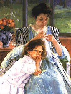
-She paints the mother/child relationship extensively.
-American upper class background, but not artistic.
-Friends with Degas

Early Twentieth Century

*Gabriele Munter (1877-1962)
-Partner of Kandinsky and part of his Blue Rider group of German Expressionists.
-Unfortunately their work was condemned by the Nazi's.

*Suzanne Valadon (1865-1938)
Blue Room, 1923
-Daughter of an unmarried laundress
-Circus acrobat and artists model
-Son is Maurice Utrillo
-This painting is an interesting nude. It feel a lot more 'real' than other portraits of women. It looks like a very personal moment, rather than a beautiful idealised figure and scene.

*Natalia Goncharova (1881-1962)
-Russian neo, primitive art
-Rayonism, a cubist based optical system that emphasised rays of light.

*Louise Nevelson (1889-1988)
-American, Russian born artist.
-Prominant in the New York art scene. A character of the time.

*Florine Stettheimer (1871-1944)
Spring Sale at Bendells, 1921
-Her work pokes fun at New York high Society.
- On a side not her sister Carrie Strettheimer made the most amazing dolls house. She spent 5 years working on this one project, showing pure dedication.

* Alice Neel (1900-1984)
-New York artists who suffered personal tragedies. She did many portraits of family members, other artists and neighbours.
Margaret Evans Pregnant, 1978
-Female gaze. A nude who appears to be questioning our gaze.
-Interestingly the image reflected in the mirror behind the figure is a very different style- almost impressionist. The reflection looks harsher and slightly uglier.

*Leonora Carrington (1917-2011)
Self Portrait, 1936-7
-Autobiographical surrealism
-She rebelled against upper class British society, which her family was part of.
-Institutionalised in 1930's but emerged to publish novels, plays and short stories.

*Georgia O'keefe (1887-1986)

Pelvis with Moon, 1943
-Strong theme of motherhood and re-production

Mid Twentieth Century

*Lee Krasner (2908-1984)
-An American artist married to Jackson Pollock
untitled 1949.
-Is from a Russian immigrant family, so grew up rather poor. Had to finance her own way through Art school by waitressing and being an artists model.
-Post Second World War, the American government really pushed for women to go back into the home but Krasner was instead involved in a male dominated art movement. 

*Niki de Saint-Phalle (1930-2002)


-'Nana's' are supposed to represent 'every woman'
- Her work is a 1960's pop art style depicting women decorated in a folk-style with exaggerated curves. The curves happened because Niki was inspired by her pregnant friend.

*Audrey Flack (1931-)
Vanitas, 1977
-Photo-realist tradition
-The fruit symbolises death and decay. Fruit always goes off.
 The pocket watch is a reference to time and the passing of it.
-Very kitsch (post pop-art)
-Symbolic still life (from the Dutch tradition in the 16th/17th century)

*Annette Messager (1943-)
My Trophies (1987)
-French artist who blurs the distinction between media. She incorporates sculpture, drawing, photography together
-Critical examination of media stereotypes.

*Rachel Whiteread (1963-)
Nameless Library, 2000
The Judenplatz Holocaust Memorial also known as the Nameless Library stands in Judenplatz in the first district of Vienna. It is the central memorial for the Austrian victims of the Holocaust. 
-Rather than being able to see the spines, we can only see the pages. Means the books remain nameless, like a lot of the victims.

*Jenny Saville (1970-)
Plan, 1993
-More fascinated by stories of the body. The body is a landscape to be surveyed.

*Yayoi Kusama (1929-)
-Japanese artist and writer who's art id very abstract.
-Childhood traumas resulted in mental health problems in later life and a lot of her work is about her mental health.


I really like her work so added quite a few images!